About

Ahead of the Curve provides you with analysis and insight into today's global financial markets. The latest news and views from global stock, bond, commodity and FOREX markets are discussed. Rajveer Rawlin is a PhD and received his MBA in finance from the Cardiff Metropolitan University, Wales, UK. He is an avid market watcher having followed capital markets in the US and India since 1993. His research interests includes areas of Capital Markets, Banking, Investment Analysis and Portfolio Management and has over 20 years of experience in the above areas covering the US and Indian Markets. He has several publications in the above areas. The views expressed here are his own and should not be construed as advice to buy or sell securities.

Featured post

Time Series Analysis with GRETL

This video shows key time-series analyses techniques such as ARIMA, Granger Causality, Co-integration, and VECM performed via GRETL. Key dia...

Showing posts with label recession. Show all posts

Tuesday 23 July 2019

Nasdaq - Nasdaq 100 Ratio at 2000 Levels - Massive Crash Just around the Corner?

After 19 long years the Nasdaq - Nasdaq 100 Ratio has reached the record lows it saw in 2000, when a hand full of tech stocks outperformed the broader market.  This occurred at the market peak just before the dotcom bubble burst taking the Nasdaq down almost 80% and the rest of the market over 40%. This time will be no different with a massive market crash just around the corner, with all signs such as global inverted yield curves and trade wars pointing to a severe recession ahead:

nasdaq - nasdaq 100 ratio - market crash

Tuesday 12 December 2017

Bitcoin 2017 Vs Home Builders 2008 Vs Nasdaq 2000

Most periods of excessive booms end with speculative busts. The dotcom bust of 2000 produced a recession so did the housing bust of 2008. Today's poster child seems to be bitcoin. Just as the internet was here to stay back in 2000 so is block chain technology today. However crypto currencies are trading at levels suggesting they could become reserve currencies of the world replacing the dollar and that implies a reset on short order. It's never different and always the same:
speculative bubbles

Wednesday 6 December 2017

Yield Curve about to Invert?

The spread between 10 year US bonds and 2 year US bonds is currently at 5 year lows and will likely go negative post the fed rate hike next week. This would most likely cause the US yield curve to eventually invert and is a harbinger of a decelerating/recessionary economy going forward. Will tax cuts save the day? I doubt it.

Wednesday 4 October 2017

Emerging Parallels to the Fall of 2007 - Hallmark of a Brand New Crisis

The fall of 2017 is increasingly looking like the fall of 2007 when risky assets topped out:

Thursday 8 June 2017

Thursday 8 December 2016

Gold - The Then and Now

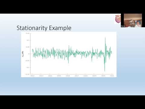
Gold prices have been incredibly volatile this year and are currently near the middle of the observed range in 2016 near $ 1175/ Ounce having started the year close to $1075 / Ounce and trading as high as $1375 / Ounce during the course of the year. Gold often benefits from increased liquidity in the financial system and has been traditionally viewed as a hedge against inflation. Gold also tends to have a safe haven status and tends to benefit during financial crises when Central Banks flood the world with liquidity. So thinking ahead lets take a look at what is in store for Gold prices?

To do this let us look at the historical performance of Gold since the Great Recession of 2008. Three years after the start of the Bernanke Fed's quantitative easing program in the United States, gold prices reached a high we've still yet to see again as this gold chart based on events that affected the price of gold and gold IRAs over the past few years since the Financial Collapse of 2008 shows. Recovering back from its January 2016 low by March, another peak in May before reaching July's high of around $1387 per ounce so far this year for GCG7 (February Gold Futures) traded on CME and Eurex exchanges looks a bit short-lived, given today's February Gold Futures price of $1173 as on December 8 2016.
gold performance chart time line

As can be seen above Gold surged sharply higher between 2008 and 2011 following Quantitative easing (QE) embarked by central banks across the globe. The gold price well over doubled from reaching as high as $1975 in August 2011. From there Gold endured a sharp correcting falling over 40% and reaching the $1050 mark in December 2015 following the first FED rate hike and the end of QE. With no further FED hikes forth coming Gold resumed its upswing reaching a high of $1387 following Brexit. However following the Trump win in the US presidential election Gold has sold off yet again on prospects of reflation, a strong Dollar and an upcoming FED hike.

With the FED taking center stage yet again It would be interesting to see if the sell off in Gold continues on a strengthening Dollar from a possible FED hike or Would gold become a safe haven play yet again much like in December 2015 and benefit from capital outflows from risky assets like stocks and emerging market currencies?

Tuesday 11 October 2016

Chart of the Week - Real Gross Domestic Income

The chart of the week is courtesy Mike Shedlock via SafeHaven and looks at real Gross Domestic Income (GDI) in the US. Every time GDI has turned negative we have had pretty significant slowdowns or recessions. The GDI has just entered negative territory indicating another major slowdown is just around the corner:

Real GDI

Monday 18 July 2016

Chart of the Week - Deutsche Bank 2016 vs Lehman Brothers 2008

The Chart of the day is via Chris Vermeulen from the goldandoilguy.com and shows a comparison of the price performance of Lehman Brothers in 2008 to the current price performance of Deutsche Bank today. With a number of European and US banks having similar charts to Deutsche Bank and the bank index not confirming recent new highs in the broader market, once can all but wonder if a repeat of 2008 is on the cards:
deutsche bank

Tuesday 5 July 2016

Chart of the Week - Global GDP

The chart of the week is courtesy of Bloomberg and shows historic and projected levels for Global GDP. Global GDP has remained below levels observed before the great recession of 2008-2009 and is expected to remain so for the foreseeable future:
global gdp

Thursday 26 May 2016

Interesting Jim Rogers Interview

A very interesting interview that legendary investor Jim Rogers did recently where he discusses an imminent global recession:

Thursday 12 May 2016

Performance of Retailers and Global Financial Institutions - Parallels with 2008

An interesting article from John Rubino via SafeHaven that highlights parallels between the rapidly deteriorating performance of  retailers and global financial institutions, very similar to that observed in 2008:

Tuesday 10 May 2016

Chart of the Day - Emerging Market Debt

The chart of the day comes courtesy The Telegraph and shows Non-Financial corporate debt in emerging markets hitting record levels in several key currencies. The debt is well over 20 Trillion dollars and is over double the amount observed in 2008 prior to the great recession.

emerging market debt 

Thursday 21 April 2016

Chart of the Day - Velocity of Money

The chart of the day shows the velocity of money (data courtesy the St. Louis Fed) since 1959. It shows that the velocity of money is below levels observed in 1959. The velocity of money typically rises during periods of growth and falls during recessionary periods. So the recent plunge to new lows suggests that QE's from global central banks have really not worked and a major recession may just be lurking around the corner.
velocity of money

Tuesday 16 February 2016

All is not Well with Global Financial Markets

It does appear that all is not as rosy as it used to be in the global financial market landscape:

First and foremost global shipping activity appears to have come to a screeching halt, as pointed out by Jeff Berwick via the Market Oracle and this likely has recessionary implications:


Secondly when a single bank's derivative exposure exceeds the GDP of a country or region you know you are bound to have problems as ETF daily news rightly points out the case of Deutsche Bank:


Thirdly as QuandaryFX points out via Seeking Alpha the S & P 500 starts turning down when manufacturing starts to turn down like we are seeing off late:


Last but not the least the Safehaven plunge into Gold,Treasuries & the Japanese yen is clearly taking hold as pointed out by Chris Vermeulen via CNA Finance:

Chart 6
USD/JPY (USDJPY=X)

Friday 18 December 2015

Interesting Market News and Views from Global Financial Markets-11

1) What the oldest stock market index is saying now

The Dow Transports are unusually weak, and a well-known investing-newsletter editor just flashed a ‘sell’ signal, writes Mark Hulbert.

2) Stock market dividend gusher may be drying up

Dividend income from the FTSE 100 could face a nasty haircut next year

3) From ‘Bubble’ to ‘Crash,’ the Incredible Origins of 7 Finance Terms

Wall Street Journal personal-finance columnist Jason Zweig’s new book, “The Devil’s Financial Dictionary,” is a satirical glossary of investing terms.

4) Five Mind-Blowing Stats from the Selloff in the Biggest Junk Bond ETF

Big numbers from a big day in bonds.

5) The Incurable Japanese Syndrome And Europe | Ec...

For the fifth time in seven years Japan is back in recession, with GDP shrinking by a further 0.2% in the third quarter. Meanwhile, inflation has fallen from more than 2% to zero in just over six months.

6) Junk-Bond Rout Deepens, Sending Shockwaves Through Stocks and Other Markets

Traders say the selloff was triggered by the abrupt liquidation of Third Avenue Management’s high-yield bond mutual fund.

Stock Market News

Amazon Deals

World Indices


Live World Indices are powered by Investing.com

Market Insight

My Favorite Books

  • The Intelligent Investor
  • Liars Poker
  • One up on Wall Street
  • Beating the Street
  • Remniscience of a stock operator

See Our Pins

Trading Ideas

Forex Insight

Economic Calendar

Economic Calendar >> Add to your site

India Market Insight

My Asset Allocation Strategy (Indian Market)

Cash - 40%
Bonds - 20%
Fixed deposit - 20%
Gold - 5%
Stocks - 10% ( Majority of this in dividend funds)
Other Asset Classes - 5%

My belief is that stocks are relatively overvalued compared to bonds and attractive buying opportunities can come along after 1-2 years. In a deflationary scenario no asset class does well other than U.S bonds, the U.S dollar and the Japanese yen, so better to be safe than sorry with high quality government bonds and fixed deposits. Cash is the king always. Of course this varies with the person's age.